Hello.
When you hear the word “Internet” or “Web” you don’t imagine instant messengers or some kind of administration tools or anything else. Your first thought are zillions of sites, that carries zetabytes of information, that is given to you in different ways like text, pictures, animation, flash, music, video and so on. So, if the device is called Internet Tablet — that means that it is profiled to give you easy and handy access to the maximum amount of internet resources. So the heart of that device should o be web browser. We gonna look at Internet Tablet browser and it’s UI closely in this article. Fire your engines!
To begin with I’d proudly like to say that OS2008 Internet Tablet’s web-browser called MicroB (also you can install it as additional engine in OS2007) is one of the best portable experiences of web browsing at all. It totally kicks Windows Mobile “Opera Mobile” and other competitors and easily competes with iPhone’s Safari that is “revolutionary extremely great new awesome and blah-blah” ;-) And it beats UMPC’s (to be fair, to that moment) because of battery life. It handles most of the sites without any render problems or crashes (actually, I haven’t seen such site :-). This is really really great and it approves the name of Internet tablet for 100%.
But nothing is ideal for 100% so after long time of everyday using MicroB I have come to some UI improvements that will help user to access most of the functions easy and quick.
First of all let’s see how it looks and behaves right now:

Right now we have Big Fat Browser Icon in top left which should to be a Mothership for all browser aspects but now it’s somehow used for quick launch of bookmarks. And that’s all. What I want to do with it I’ll describe a bit later, let’s see other items.
Going clockwise, we have a “view options” button. It pops up a menu where you can adjust images visibility and loading priority, activate some browser media add-ons to display (like flash), set zoom amount, toggle “fit to width” mode, when browser tries to reformat web-page… to fit screen’s width :-) and the last you can enable “find on page” menu, which behaves exactly as it said. After short adaptation it becomes very handy. The one thing I wanted to demand is to give user some “media profiles”. For example, while on cellular connection the MicroB will automatically disable flash and images loading to increase speed and save money :-). And while on Wi-Fi it enables all. As for me I’m a bit tired but get used to always switch them with my hands.
Then we can see three absolutely standard buttons for every browser: Go/back/forward. But. While everybody knew it for a long time that tap’n’hold on “go” makes the refresh of the page, in this time almost nobody knew that on tap’n’hold on back/forward they will pop-up the history of opened pages. I was dreaming about this feature and already made mock-ups of interface and so on, and hen I just found it by chance :-) This is very great feature and I’m glad that it’s already made :-)
Now we came to the address bar. For the first sight there must be nothing special and nothing to do. But. Micro, as it’s elder bro Firefox have (actually had) a great feature: you can just type a search request that you need in the address bar and it will be automatically searched in Google. But in OS’08 developers made some very (extremely) strange thing: now it actually searches Google BUT it shows you the page that was the first in Google’s results table (A.K.A. “I’m feeling lucky”). That’s crap. Sorry but it is. Please, bring back standard search results, I think everybody were happy with them :-(
Ok, let’s move on. Then we have an optional RSS button, that appears when RSS feed is available. This is great. You can subscribe to the feed in one click right in the browser. Awesome. You guys got the right steam!
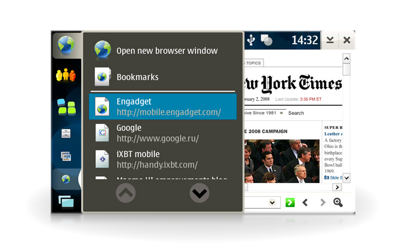
And the last one is “Bookmarks & History” button. It pop-ups a small menu where you can choose, add and organize bookmarks (again), manage and explore your browsing history and quickly jump to your homepage. Ok, we’re done with describing. Let’s see how it works.
You click on the Big Fat Browser Icon and tap “Open new browser window”. Then enter preferred address and you’re there. Or you can just choose a bookmark and new window will automatically open. If you click a bookmark when the window is already opened – then it loads in it. That’s ok. But how can we navigate thru two or more windows? You can click the browser icon in the taskbar and you’ll see a list of opened windows.

Ok, but what should I do when browser taskbar icon is out of sight? Well, almost no problem, just tap bottom-left icon (window manager) and you’ll see… a list of all opened programs. Oook, now we’re gonna find our browser and tap it. In my example there are just four apps opened. But what if I’ve opened 6 browser windows, a few Pidgin chat windows and media player? I need to scroll thru all of them just to find the browser window that I need. Pay attention that Big Fat Browser Icon that is always visible and is staying unused all this time. let’s give it some work!

Here you can see a totally rearranged web-browser menu.
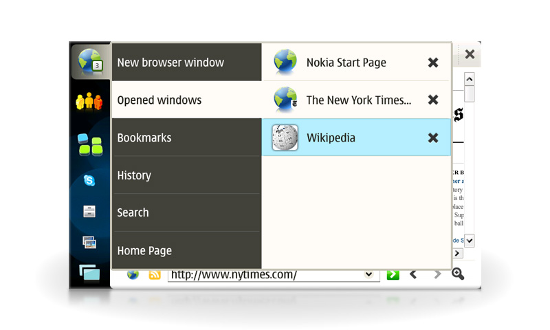
First of all — the number on the icon. It shows you the number of opened windows right now. It helps you to quickly manage your Tablet’s performance. It can handle 2 digit numbers :-) Then. We click on it and see well known two-sided menu that you can see by clicking “applications”. It behaves the same way on overflow. Let’s take a look on that menu. Right after clicking the left menu is standing on the “opened windows” position and shows you a list of opened windows on the right side. You can close them right there. Now I’m gonna tell you some hint/suggestion.
As you can see there are three windows with different favicon (that small square on the globe) properties. Nokia start page have no favicon, NYT have standard 16×16 favicon. But what’s that with Wikipedia? Photoshop? Not really. It helds the advantage of the “iPhonomania”. technically it takes a picture that is dedicated to be taken by the iPhone/iPod Touch. They use a special 57×57 .png file named “apple-touch-icon.png” that is always placed in the site root, to use it in WebClip shortcut. So, why not to use it too? :-) And if there is no such file then we can use “oldskool” favicons.
Let’s go on. Next menu tab is “Bookmarks”. I’ve combined whole bookmark management in there: adding, organizing and choosing — all things thru one simple and easy to access menu. Bookmark groups behaves the same way like the old. On the screenshot there is “Google apps” group displayed.
History behaves exactly the same way like bookmarks: white list — day groups and sub-menus — links. Easy and relative.
Search is a special kind of bookmarks – there you can add your preferred search engines or sites like Wikipedia, Google, Yahoo! and so and so on for instant access.
And the last one is a quick jump to your homepage.

So. As you can see we have made an easy and very handy access to all browsing aspects: quick switching, closing, opening, bookmarking, organizing and searching. And we used only native OS’08 tools that are already (almost) available. In Chapter II we’ll discuss and improve other aspects of MicroB like quick copy/paste, roll over mode, scrollbars and others.
Stay tuned!


There are some really great ideas to make live easier.
Is this artikel meaned as “Guys look what would be great” or is there actually a patch/hack where we could change the layout?
Eismaus
Comment by Eismaus — February 4, 2008 @ 10:24
No, actually right now these are only ideas and thoughts. But I think if the ideas will be useful, Maemo team or other developers will take and make it possible :)
Comment by Andrew Zhilin — February 4, 2008 @ 13:15
This is a really good idea… Please submit it as an enhancement to the maemo bug tracker! Let us know too, because I’ll vote for it (as will many others I suppose).
Comment by timsamoff — February 4, 2008 @ 14:34
Agreed, I like many – if not all – of the ideas in this post.
Only problem I can see with the revamped bookmarks, is being able to see so few items.
Making the big icons in the Task Navigator more dynamic has got to be a good thing, although I often have a full screen browser window. Using the home key (or “swap” as Nokia now call it) to bring up a list of all open windows is a decent-enough replacement for tabs (apart from “Open link in new tab in background”). So I’d still like the browser windows to appear in the window list.
Comment by aflegg — February 4, 2008 @ 20:15
Writing from the tablet, and there are several issues with the browser that I wish I had a magic wand and genie to fix. Those things spoken here are good though, and I wouldn’t be opposed to them at all.
I’ve been in this browser for the better part of the last 3hrs; the performance is just something that is a major knock against it. Especially when typing in text boxes, things get slow and crazy, as if someone left debugging code on and is reading it while you type.
Suggestion: take the suggestion you made for the large globe, and make that large globe replace the small one when a user goes full screen. When not full screen, take the small globe off the screen entirely. This keeps the finger-ability of the browser, while also keeping the ability to not have to go menu diggin for features.
To those remarking that these should be submitted to a bug list, these aren’t bugs, these are UI/UX issues that are seperate from bugs, but will lead to them if not carefully considered. A place like this to bring them up and discuss them is better before submitting to such a list, if such a listing should be submitted to at all for what amounts to feature requests.
Comment by arjwdotcom — February 5, 2008 @ 03:36
I should have browsed around before posting last night. Here’s nearly exactly to the tee the type of user interface and user experience one should have:
View video of Opera Mobile 9.5 browser (http://www.opera.com/b2b/solutions/mobile/video/), specifically the time period 3:00 – 5:00. Its nearly exactly what has been described here, with a few other niggles.
Comment by arjwdotcom — February 5, 2008 @ 16:43
Yes, Opera did great work on it’s browser and as it’s told on their website it will be avaliable on linux devices :-). But It’s optimized for small resolution displays. I don’t know if «article zoom» to the whole 800px will be easyreadable. The only «no doubt» impressive feature is speed. Even on HTC Touch – one of the slowest PDA’s. Otherwise it’s only 240×320, let’s see how it behaves on hi-res screens.
Comment by Andrew Zhilin — February 5, 2008 @ 17:03
Zoom might not be great for the tablet (for some users, I’d prefer it actually); but that’s no so much my reason for bringing up Opera Mobile 9.5 in this thread. Considering our chat about UI that is contextually relevant, especially in the browser, Opera Mobile seems to have gotten it, and well.
One of the issues that I run across that was pointed on in this post is how the menus while there, take to many taps before one gets to a point where they do an action. This kind of flow should be a lot more seemless on a device like an IT where speed and efficiency should be even more of a concern than on a larger screen-ed device. From the looks of things, a PC like paradigm has been adopted, and that’s not the one that MIDs/UMPCs/ITs need. They are different, and as spoken in this thread specifically, it should be designed as such.
Looking foward to the Part 2 of this one; I didn’t want to get too far off topic and speak ahead (again) of the conversation.
Comment by arjwdotcom — February 8, 2008 @ 21:18
[…] of all it’s cool to see “mouse over” mode (as I was calling it long ago, but haven’t got time to describe it in pictures though) in MicroB (Timeless said that […]
Pingback by Fremantle: Browser zoom. « Maemo UI improvements blog. — September 4, 2009 @ 03:37
The next time I read a blog, Hopefully it won’t disappoint me as much as this particular one. I mean, I know it was my choice to read through, but I truly believed you would probably have something interesting to say. All I hear is a bunch of crying about something you can fix if you weren’t too busy searching for attention.
Comment by Manish — April 12, 2013 @ 23:06
search Engine rank Checker
blog topic
Trackback by search Engine rank Checker — October 31, 2020 @ 02:23